Configuring Header

Contents
On the Configuring Table Library screen, click this  icon to configure header information.
Field |
Description |
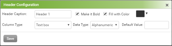
Header Caption |
In addition to the Edit icon, you can also change the header caption from here. |
Make it Bold |
Select this check box to keep the header text bold. |
Fill with Color |
Select this check box to fill the cell with color of your choice. |
Column Type |
Select which control you want to have in that column, for example, Date, Text box, Check box, etc. Based on the Column Type selection, you can make the further selections.
Text box – Select Alphanumeric, Decimal, or Integer in Data Type drop down. Choose the Default Value that should appear when this table is accessed in charting.
Label - Choose the Default Value of Label that should appear when this table is accessed in charting.
Date – Choose whether you want to see Current Date as your default date or the Encounter Date when this table is accessed in charting.
Drop-down / Multi select drop-down – Enter the values that should appear in drop-down when this table is accessed in charting. You can add a value and click
Check box – Enter the captions that you want to see as a check box caption when this table is accessed in charting. You can add a value and click
Vertical: Select if you want to place check boxes one after another in new line.
Horizontal: Select if you want to place check boxes one after another in same line.
Single: Select this option if you want to have mutually exclusive check boxes. That means, at once, you will be able to select only one check box of all.
Multiple: Select this option if you want to allow multiple selection. That means, you will be able to select multiple check boxes at once.
|
 and so on.